Categories
Played

Games of 2012: The Unfinished Swan

I’ve spent a lot of time in 2012 playing games, but not a lot of time writing about them. As I did last year, I’d like to tell some stories or share some thoughts about the ones that meant the most to me this year. I’ll be posting one a day until Christmas. See all Games of 2012 posts.

Today, a friend of mine lashed out on Twitter over a familiar argument bubbling up again:

I don’t blame him. The Internet loves to argue about things that can never truly be settled, and “are games art?” is up there on the list of Never Ending Debates. It gets particularly bad when titles with lofty aspirations and long lead times are nearing release; their game designers make grandiose statements to the press, someone disagrees, and then everyone throws down.

“Are games art?” is a pretty ridiculous question, so very broad in scope. “Is this particular game I’m talking about art?” is slightly less ridiculous, but still an exercise in subjectivity, not logic or reason. The best question I can form, if I’m trying to be introspective, is “Is this particular game doing something interesting with the medium of video games?”

My initial time with The Unfinished Swan was one of the times this year I could answer that with a “yes”. The first moment the game hands control over to you, the screen is completely white. Pressing on the joysticks appears to do nothing. With enough pawing at the controller, you summon and fling a black ball through the air, which splats satisfyingly against a wall. In the inky mess, you get clarity as to what your charge is. You throw more ink, and the world suddenly begins to reveal itself around you. Maze-like walls open up to reveal sloping paths, trees and ponds fill in around you. You’ll see yellow footprints in the distance, your breadcrumbs to help you chase down the titular swan. The game does next to nothing to hold your hand in this stretch – you will have to find your own way.

That sense of discovery and wonder in the beginning is incomparably wonderful. The way the ink splatters across the landscape created a beautiful contrasting landscape. I have deep respect for games that can run with a unique visual style, and The Unfinished Swan had it in spades. It was reminiscent of the opening minutes of Portal, as you gradually learn without the game resorting to signposting or explicit tutorials.

I loved that opening motif so much that I felt let down when the game started to add other visual elements and change the mechanics. Shadows appeared, then colors; my ink blobs changed to water blobs and I was forced to solve some more puzzles. What started as unique quest of discovery turned into a first person puzzler that feel conventional. (It’s somewhat telling that most of the media and marketing descriptions of the game don’t mention this change.) Even as the plot continued to unfold interestingly, I found myself losing interest, and left it unfinished (oh the irony!) despite what I’ve been told is a terribly short running time.

I will probably get back to it later this month and polish it off, but it’s difficult to find the motivation. I know that combination of what is essentially a bedtime story with a video game – with gameplay and visual style so tightly entwined – isn’t what awaits me if I re-enter that world. I don’t care whether or not The Unfinished Swan meets anyone’s definition of art. What I care about is if it’s interesting or unique within the expansive spectrum of video games. The beginning absolutely was; the rest, not so much.

If only there was a way to turn young Monroe around, to stop worrying about that eternally honking swan, and return to that pond I stumbled onto at the beginning.

The Unfinished Swan is available on PSN.

Categories
Played

Games of 2012: Rock Band Blitz

I’ve spent a lot of time in 2012 playing games, but not a lot of time writing about them. As I did last year, I’d like to tell some stories or share some thoughts about the ones that meant the most to me this year. I’ll be posting one a day until Christmas. See all Games of 2012 posts.

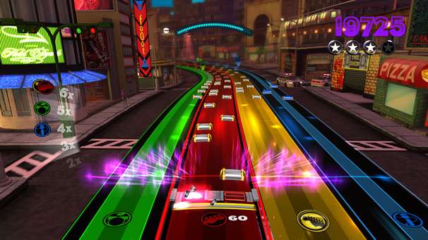
When game historians look back on this era, they will hold up Rock Band Blitz as a shining example of muddled, poorly thought out game design.

This should’ve been a slam dunk. Take a beloved music game franchise, and give gamers who have invested in that franchise a way to reuse all their content. Wait, no, even better: give them 25 more songs for that franchise they love when they buy your $15 game. And don’t even go very far in inventing a different model of actively playing the game – it plays similarly to Frequency or Amplitude, games Harmonix released a decade ago. (Hell, it’s even simpler: there’s only two notes per track!)

But then Harmonix decided to tinker. They added a “coin” system in which one has to buy power-ups per song. This mechanic has been beaten into the ground by Popcap and other Facebook game developers, who tend to make sure there’s a giant button nearby that says “BUY MORE COINS”. Weirdly, there’s no opportunity to buy additional coins; there’s no appeal for you to spend any money other than on additional songs. But a full slate of powerups cost enough that you won’t earn as much back, so it’s a pretty constant dwindling of your coin stash.

But wait! Harmonix added a special challenge system, where weekly goals provide you the opportunity to win additional coins if you play well. It would’ve been an acceptable trade-off, except for one tiny thing: the only way to get into the goals is through a Facebook app, not in the game itself. Almost all of the social elements of the game are driven into Facebook; if you don’t sign into the app, you will never get to touch that part of the game.

Want to accept a new goal? Have to go to your computer and log into Facebook.

Want to check on how far along you are on a particular goal? Have to go to your computer and log into Facebook.

Want to challenge your friend to a “Song War”? Have to go to your computer and log into Facebook.

We are 6+ years into the current console generation. Sony and Microsoft have both put a ton of energy and money into developing reasonably functioning social networks within their consoles. Forcing your paying customers to use an interface outside of the game to access core functionality is such a shockingly poor move, I honestly can’t believe it game from a developer with the level of good will and community faith that Harmonix had.

Long time Rock Band fanatics were all crushed. Plaguefox on NeoGAF provided a good take on why this is all so messed up, with this money quote:

Unfortunately, it isn’t working. I am coming away from each play session aggravated. I’m not ending sessions just because I’ve had enough play time, I’m cutting them short because the game mechanics are working against me in a way that saps all of the joy of playing out over the course of a handful of songs. I think I’m officially in the “I regret buying this game” camp at this point.

Rock Band Blitz easily takes the cake for the most disappointing title I played in 2012.

Rock Band Blitz is available on PSN and XBLA, and is perhaps only worthwhile as a cheap songpack for Rock Band proper. My experiences were with the PSN version.

Categories
Debated Enjoyed

For The Love Of PixelJunk Racers

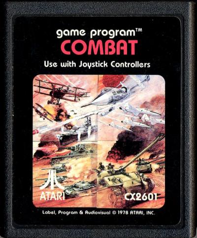
The first significant pack-in with a video game system was the Atari 2600’s Combat.

Combat is fairly ugly, and has simplistic gameplay. You are a tank (or biplane, or jet). Pressing Up on the joystick moves you forward; pressing Down moves you back; Left and Right turn. The Fire button lives up to its name and fires your cannon. The goal: shoot your opponent before they shoot you.

What made Combat interesting is that it wasn’t merely one game type – which it easily could have been, given the space constraints of the time. Instead, by making slight variations to the rules of the world, Atari crammed twenty-seven different game types in. A mode where bullets reflected off walls, or you had more than one vehicle, or you couldn’t see the walls.

Combat allowed deep variation through slight changes to the environment.

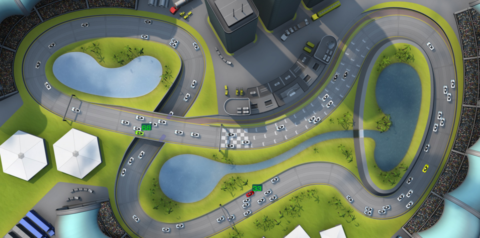
Nearly thirty years later, we arrive at yesterday’s release of PixelJunk Racers, a $6.99 downloadable game on the Playstation Network from PixelJunk.

In a generation full of gorgeous games, PixelJunk Racers is not the prettiest game in the world. IGN dismissed the graphics as “crisp, but unfortunately the backgrounds are horribly bland and static.”

PJR, like *Combat*, has simplistic controls. You are a car. L2 or R2 are the gas. Left and right on the directional pad change lanes. That’s literally it. Most people will pick it up in about thirty seconds.

PJR becomes interesting for the same reason Combat is: slight changes to the environment provide endless gameplay variations. The game features thirty-two game types that are all created through slight variations to the rules and physics. You’re fast, everyone else is slow – pass as many cars as you can. You’re slow, everyone else is faster – don’t get hit. You’re fast, but slowing down – run into someone else for another energy boost. And so on.

Plenty of games offer customization; it’s easy to give a gamer a bunch of sliders and controls and let the gamers figure them out. Combining these rules in interesting ways should be a challenge for the developers first, and the gamers second. Too many games cop-out and provide laundry lists of options. Developers should strive to provide many varied preset combinations of rules – and if you allow users to define their own, let those combinations be saved and, even better, shared between users.

(PJR, interesting, not only combines the rules of the world into different pre-defined game types, but then combines the different gametypes into sets of three to create pre-defined party modes. Result: party games that stay fresher longer.)

Back to PJR: the game is addictive, challenging, and flat-out fun. Yes, ultimately the mechanics are simple. Yes, the game is made up of slot cars. But isn’t that what we’re all supposed to be into these days – simple, easy to pick-up games? Casual games? PJR finds the balance between the simplistic and the complicated, the shallow and the deep, the meh and the addictive. It can appeal to the hardcore gamer who loves to grind high scores as well as the casual gamer who just wants a quick five minute distraction.

With ten tracks, offline multiplayer for up to seven, online leaderboards, and a progressive tournament mode, you’re looking at a pretty robust game for a very small cost. I highly recommend PixelJunk Racers for anyone with a PS3.

If you’re interested in other deep-variation-through-slight-change games, I invite you to investigate the Halo series (specifically the multiplayer), Airburst Extreme (for variations on a theme), and MLB 07 The Show (the “My Sliders” feature).