Categories
Debated

WWDC08 Keynote – iPhone 3G

> “The best part of WWDC is the post game analysis. And booze.”Michael Lopp

(I’m breaking up my thoughts about the WWDC keynote into multiple posts this year.)


In the post keynote fracas, I was asked by multiple friends if I was upgrading. My answer shocked each and every one – a fairly blasé “no”. One friend shouted over IM that I would soon cave. (I’m taking the reaction as a sad commentary on how I am perceived.)
This isn’t to say the iPhone 3G isn’t a good model; it corrects most of the gripes leveled at the original iPhone. Data speeds are faster, batteries last longer, and it has a true GPS module. The headphone jack is flush, eliminating a market of headphone extenders. The cost of the handset is far cheaper. Hell, it even comes in an additional color. Certainly, if you’re in the market for an iPhone, it’s a great model to start with – just not to upgrade to.

A $200 mobile upgrade is not the most expensive thing in the world – we are talking about a handset that started at $499 – but it’s not a drop in the bucket. That $200 gets you a double data rate, but along with that you’re stuck with an additional $10 a month on your bill. This adds up quickly over the life of your new two year contract extension. The true GPS is nice, but I’ve found the fake GPS to be working fairly well. The extended battery life is not a feature point I can wave away, but collectively, that’s the end of the feature list. All the benefits of the 2.0 software – the app store, app installation, push email support – will be on the first generation handsets as well.

Is all of that worth $200? For once, I can’t say yes. Never mind the newly discovered activation hassles. Never mind what will undoubtedly be new hurdles towards jailbreaking and unlocking (for those into those sorts of things).

The simple conclusion: if you don’t have an iPhone, it’s a fantastic phone to start with. It’s going to be the perfect time to jump in. But if you do have an iPhone, you may want to ponder whether the total cost is worth the fairly small bullet list of features.
Categories
Best Of Explained

HOWTO: iPhone Webclip Icons

I remember, years ago, I was baffled by the little 16×16 icons that were showing up in my URL toolbar, and it took a surprising amount of searching to find out how to create one. I refuse to let this happen again.

So: if you want to make a custom icon for your website that will show up in the Springboard when a user makes a “webclip”, using their iPhone or iPod Touch, the dirt simple way is:

* Create a 57×57 PNG.
* Name it “apple-touch-icon.png”
* Throw it in the root folder of your website. (Not the root of your server, the root of your web documents.)

Boom. If you add a webclip for vjarmy.com, you’ll see my smiling mug.
If you want more flexibility – perhaps you don’t have access to the site root, perhaps you want to use a different file name or format – you can use a link tag in the head of the document, such as:

<head>
<title>iHelloWorld</title>
<link rel="apple-touch-icon" href="/whatever.jpg"/>
</head>

I’ve tested this with a slightly larger (75×75) JPEG, and it works without trouble – it just scales things down.

If you’re testing this on your iPhone, you may notice a pause of a few seconds before the icon appears when you press “Add To Home Menu”. I’d imagine the icon only downloads when you request to make a webclip, instead of the “request it every time” method used for fetching favicon.ico. (As for why it’s a few seconds – well, that’s EDGE for you. The lag goes away when you use WiFi.)

Apple has more info on their iPhone Dev Center; look at “Create a WebClip Bookmark Icon”.

And don’t worry if your icon design skills aren’t up to snuff, but do worry if you care about the sanctity of your image:

>Safari will automatically composite the icon with the standard “glassy” overlay so it looks like a built-in iPhone or iPod application.

Addendum @ 9PM: I should note another oddity: there’s some degree of clipping off the sides of the icon that can’t really be controlled. I found this by scaling down a circular logo (in EPS format) to 57×57, and there was a noticeable clip on the sides. With that in mind, I recommend adding a pixel or two on the sides if you’re using a circular design. Note that scaling the icon down under 57×57 does not solve this, it merely scales it up to fit the 57×57.

Addendum @ 10PM: Neil Epstein, Technology Director for Gothamist LLC, says 47×47 seems to be the usable area, and that he had best luck with 45×45.

Addendum @ 1/16 7AM: Playground Blues notes that because of the resolution of the iPhone screen, using an oversized image (such as his 158×158 image) may result in a crisper icon. [via HicksDesign]

Categories
Explained

Tutorial: Easy Archiving for Gmail IMAP

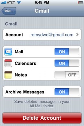
Long overdue update: There was a post here explaining how to mess with your iOS settings to get the Mail application to “archive” instead of “delete”, as some people prefer one behavior over the other.

As of iOS 4.2, this tutorial is completely unnecessary, as there’s a setting to choose whether you want the now-default Archive method, or a regular old delete. You can find it in the main account settings for your Gmail account:

I have nuked the previous tutorial, as it was confusing and useless in light of Apple engineering out a better option.