A facelift for the $20 bill – May. 13, 2003
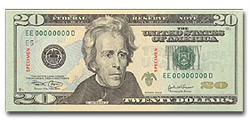
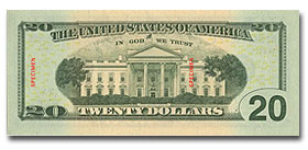
As per my article yesterday, here’s the actual design:


The Treasury Department’s Bureau of Engraving and Printing introduced the new design, still featuring Andrew Jackson on the front but without the old circle, and a background with subtle green, “peach” and light blue hues.
Sounds more like a wine review than anything else.
Categories