Categories
Found

WWDC08 Keynote – iPhone App Demos

> “Loopt is a location-based social network for douchebags who wear two ill-fitting polo shirts at the same time.”John Gruber

(I’m breaking up my thoughts about the WWDC keynote into multiple posts this year.)


More than any other segment of the keynote, the demonstrations of the applications excited me the most.

* Sega, Super Monkey Ball – One of the sources I was following during the event said the graphics were “as good as the DS”. To me, it looks a lot better than many of the games on the DS. The price point is lower than most of the Super Monkey Ball games, but this one isn’t really grabbing me, probably because I’ve played SMB so many times over the years. (Also: if you’re giggling about the name, you probably still think “Wii” is hilarious.)
* eBay, Auctions – Auctions isn’t much more than a native front end into eBay’s API, but the experience is so well done, I can only hope that other companies can follow eBay’s lead in developing
* Loopt – I fully expect there to be lots of location-aware social networks forming around the iPhone, but I expect Loopt to get a big boost for being featured in the keynote. Hey Dodgeball? You’re on notice.
* Six Apart, Typepad – the TypePad client looks like a simple, clean blogging client. But I’m not a TypePad user; I use MovableType (and Tumblr). I asked Anil Dash if there was any reason the app won’t work with their other products, and I was greeted with a no comment.
* Associated Press, Mobile News Network – it’s truly a thing of beauty to watch the Associated Press innovate within the news space. The citizen journalism things are a thing of beauty. NowPublic? You’re on notice.
* Pangea – I have no great love for Brian Greenstone, although I admire his tenacity for sticking in the Mac software industry for so long. Enigmo looks promising, but Cro-Mag Rally was generally regarded as a poor cart game when it was originally released. Still, to hear that porting apps from OS X was largely painless is good news.
* Cow Music, Band – very interesting music making app, and I look forward to seeing where the iPhone drives music creation tools.
* MLB.com, At Bat – I’m not much for baseball, but kudos to MLB for so quickly integrating nearly real-time video into their box scores. This is a killer app for many of the guys in my office.
* Modality – when Scott said the medical community has been flocking to the iPhone, they aren’t kidding. Modality is not an obscure app – I’ve been told we use it in our curriculum at the medical college. The iPhone is going to be a great platform for building rich educational apps for all curriculums.
* MIMvista – again, seeing these apps make me smile because I know there’s lots of latent interest in the medical community for clinical applications.
* Digital Legends Entertainment, Kroll – the animation style reminds me a bit of *Dragon’s Lair*, although it looks to have slightly more gameplay. I guess we’ll see how it ends up in September.
Categories
Found

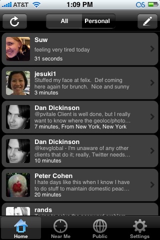
Examining Twinkle for the iPhone

Twinkle - Home

An interesting new iPhone Twitter client appeared within the development community over the weekend. It’s called Twinkle, and while there’s no official homepage for it, there is (naturally) a Twitter account.

The interface is clean, although it’s a little hard to read while you’re walking due to what looks like an 8pt font. But as for why it’s interesting:

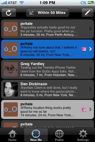
Twinkle - Near Me

Twinkle is (through what is undoubtedly some interesting magic) using the iPhone location APIs to geolocate the messages sent through it. It also allows for pictures to be attached.

Curiously, unlike other attempts to add geographic metadata to Twitter, none of this information is stored within the Twitter message. (You can see this on the web version of the message pictured above.) Twinkleking has mentioned that the pictures are being stored on his/her/their web server, and I would assume the geolocation data is being similarly shadowed.

Twinkle - Post

While I’m not crazy about shadow systems like this, Twinkle does work terribly well at what it intends to do – it’s a very natural enhancement to the Twitter experience.

It also gets me thinking that, between this and some of the other technologies people have tried to shoehorn into Twitter, that Twitter itself may want to consider providing some sort of extensibility to their base message model. Being able to add machine-readable metadata to any tweet, much like the machine tags on Flickr, would allow for all sorts of useful enhancements without breaking the core model.

Categories
Best Of Explained

HOWTO: iPhone Webclip Icons

I remember, years ago, I was baffled by the little 16×16 icons that were showing up in my URL toolbar, and it took a surprising amount of searching to find out how to create one. I refuse to let this happen again.

So: if you want to make a custom icon for your website that will show up in the Springboard when a user makes a “webclip”, using their iPhone or iPod Touch, the dirt simple way is:

* Create a 57×57 PNG.
* Name it “apple-touch-icon.png”
* Throw it in the root folder of your website. (Not the root of your server, the root of your web documents.)

Boom. If you add a webclip for vjarmy.com, you’ll see my smiling mug.
If you want more flexibility – perhaps you don’t have access to the site root, perhaps you want to use a different file name or format – you can use a link tag in the head of the document, such as:

<head>
<title>iHelloWorld</title>
<link rel="apple-touch-icon" href="/whatever.jpg"/>
</head>

I’ve tested this with a slightly larger (75×75) JPEG, and it works without trouble – it just scales things down.

If you’re testing this on your iPhone, you may notice a pause of a few seconds before the icon appears when you press “Add To Home Menu”. I’d imagine the icon only downloads when you request to make a webclip, instead of the “request it every time” method used for fetching favicon.ico. (As for why it’s a few seconds – well, that’s EDGE for you. The lag goes away when you use WiFi.)

Apple has more info on their iPhone Dev Center; look at “Create a WebClip Bookmark Icon”.

And don’t worry if your icon design skills aren’t up to snuff, but do worry if you care about the sanctity of your image:

>Safari will automatically composite the icon with the standard “glassy” overlay so it looks like a built-in iPhone or iPod application.

Addendum @ 9PM: I should note another oddity: there’s some degree of clipping off the sides of the icon that can’t really be controlled. I found this by scaling down a circular logo (in EPS format) to 57×57, and there was a noticeable clip on the sides. With that in mind, I recommend adding a pixel or two on the sides if you’re using a circular design. Note that scaling the icon down under 57×57 does not solve this, it merely scales it up to fit the 57×57.

Addendum @ 10PM: Neil Epstein, Technology Director for Gothamist LLC, says 47×47 seems to be the usable area, and that he had best luck with 45×45.

Addendum @ 1/16 7AM: Playground Blues notes that because of the resolution of the iPhone screen, using an oversized image (such as his 158×158 image) may result in a crisper icon. [via HicksDesign]